웹/CSS
[CSS] grid 레이아웃 - 실습
Judith Hopps
2023. 1. 8. 11:56
반응형
1. 부모 적용 속성들
display : block / grid
grid-template-columns[rows] : 1fr 1fr 1fr 100px
gap
grid-auto-row : auto / minmax(160px,auto) /
justify-items
align-items
2. 자식 적용 속성들
grid-column
grid-row
grid-column
grid-row
justify-self
align-self
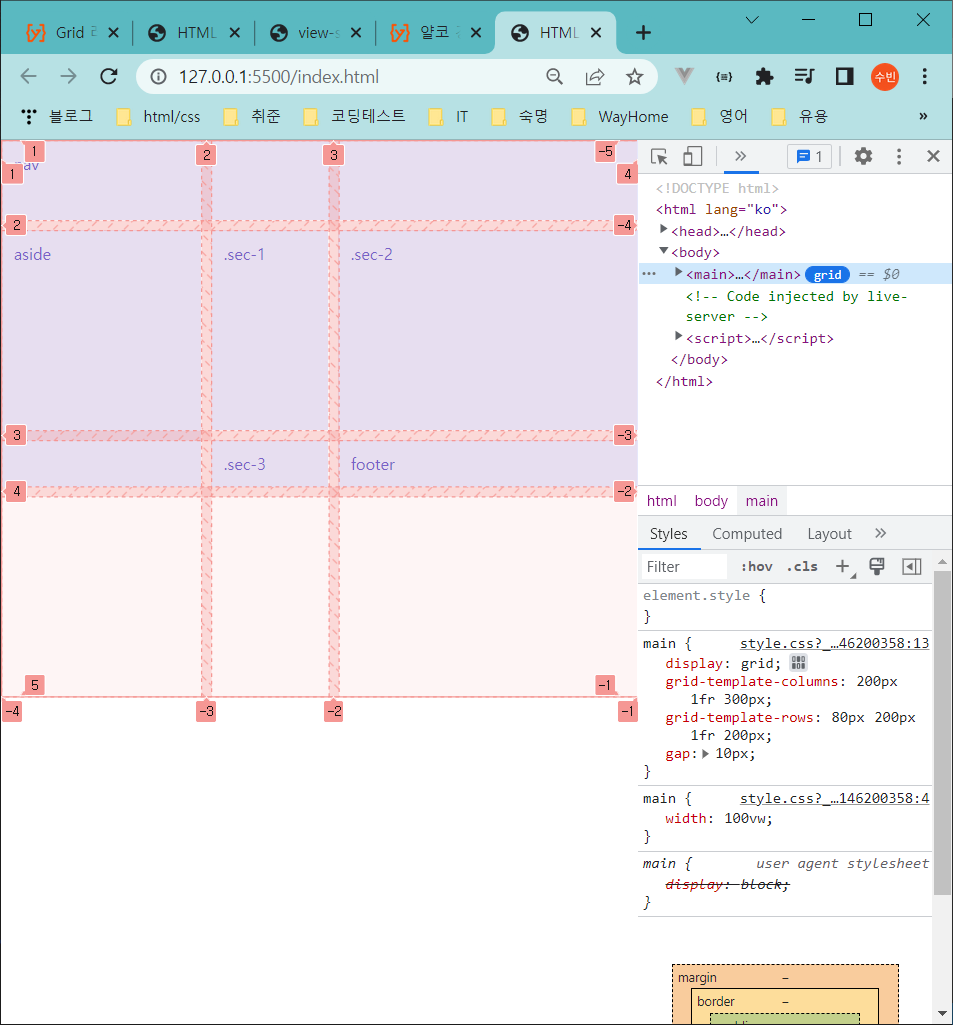
3. grid 레이아웃 실습 :
초기 모습)
실습 과정) 개발자 도구의 grid 클릭
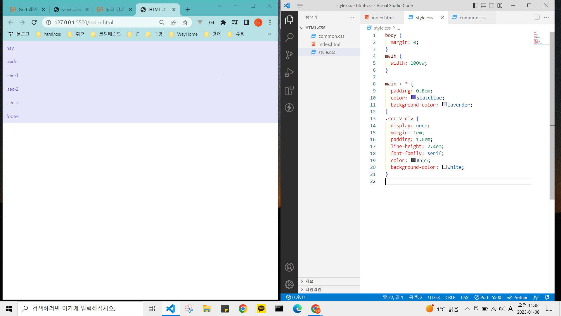
<완성 코드>
body {
margin: 0;
}
main {
width: 100vw;
}
main > * {
padding: 0.8em;
color: slateblue;
background-color: lavender;
}
main {
display: grid;
grid-template-columns: 200px 1fr 300px;
grid-template-rows: 80px 200px 1fr 200px;
gap: 10px;
}
.sec-2 div {
/* display: none; */
margin: 1em;
padding: 1.6em;
line-height: 2.4em;
font-family: serif;
color: #555;
background-color: white;
}
nav {
grid-column: 1/-1;
}
aside {
grid-row: 2/4;
}
.sec-1 {
grid-column: 2 / span 2;
}
footer {
grid-column: 1/-1;
}
반응형