웹/CSS
[CSS] 변형과 애니메이션
Judith Hopps
2023. 1. 8. 13:02
반응형
1. transform 속성
주위 요소들에 영향을 끼치지 않으면서 요소의 모습을 바꿉니다.
ex)
scale: 크기
rotate(45deg) : 각도translate (x,y) : 위치skew(0deg, 30deg) : 왜곡
2. transition 속성
👉 MDN 문서 보기
👉 cubic-bezier 값 생성기
transiton 속성은 CSS 값이 달라질 때 요소에 어떤 효과로 반영될지 지정합니다.
속성, 지속시간, 시간함수, 지연시간 순으로 값을 넣을 수 있습니다.
주의! 적용할 CSS 속성이 이미 기존값이 적용되어 있어야 동작합니다.
ex)
transition : left 2s ease-in / background-color 1s /all 1s
3. animation 속성
animation 속성을 사용하면 자바스크립트 없이
요소에 애니메이션을 적용할 수 있습니다.
@keyframes roll-and-round {
/* 시작 */
from {
left: 36px;
border-radius: 0;
transform: scale(1) rotate(0deg);
opacity: 1;
}
/* 중간과정 추가 */
/* 67% {
transform: scale(2) rotate(540deg);
border-radius: 10%;
opacity: 1;
} */
/* 끝 */
to {
left: 600px;
border-radius: 100%;
transform: scale(0.25) rotate(1080deg) ;
opacity: 0;
}
}
/* 요소에 애니메이션을 적용 */
#square {
/* 사용할 애니메이션의 이름 */
animation-name: roll-and-round;
/* 지속시간 */
animation-duration: 2s;
/* 시간함수 */
animation-timing-function: linear;
/* 지연시간 */
animation-delay: 1s;
/* 반복 횟수 */
/* animation-iteration-count: 3; */
animation-iteration-count: infinite;
/* 진행방향 */
/* animation-direction: reverse; */
/* animation-direction: alternate; : 돌아옴 */
}
4. 실습
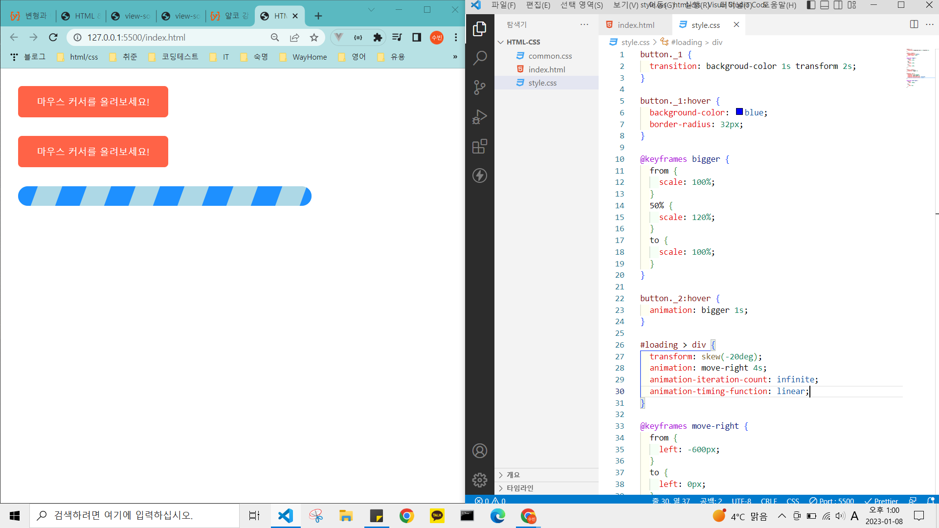
파일 참고
animation.html
0.00MB
style.css
0.00MB
반응형