
React/과제 테스트
[인사정보] input,유효성 확인, dropDown, 하단창
Judith Hopps
2023. 8. 9. 21:26
반응형
🐇 input - map으로 반복 및 에러 창
이름, 이메일, 닉네임을 각각 input 태그로 입력받고 나열하여 보여준다.
이름, 이메일, 닉네임에 대해서는 유효성 확인이 필요합니다.
1. 배열 나열 - key
{["name", "email", "nickname"].map((v) => (
<div key={v} style={{ position: "relative" }}>
<Input
value={eval(v)}
onChange={(event) =>
changeValue(event, v as keyof typeof typeToKorean)
}
type={v as keyof typeof typeToKorean}
/>
</div>
))}
2. 입력값이 잘못 되었을 경우 input 아래 유효성 확인한다.
🥕 유효성 검사
※ 객체 키값 타입 - keyof typeof {}
- typeof : 객체 데이터를 객체 타입으로 변환해주는 연산자
type Fruit = { red: string; yellow: string; green: string; } - keyof : 객체 형태의 타입을, 따로 속성들만 뽑아 모아 유니온 타입으로 만들어주는 연산자
type Union = keyof Type; // type Union = name | age | married
※ Regex - regexp.test(검사필요한 변수)
|
표현식
|
의미
|
|
^x
|
문자열의 시작을 표현하며 x 문자로 시작됨을 의미한다. |
|
x$
|
문자열의 종료를 표현하며 x 문자로 종료됨을 의미한다. |
|
.x
|
임의의 한 문자의 자리수를 표현하며 문자열이 x 로 끝난다는 것을 의미한다. |
|
x+
|
반복을 표현하며 x 문자가 한번 이상 반복됨을 의미한다. |
|
x?
|
존재여부를 표현하며 x 문자가 존재할 수도, 존재하지 않을 수도 있음을 의미한다. |
|
x*
|
반복여부를 표현하며 x 문자가 0번 또는 그 이상 반복됨을 의미한다. |
|
x|y
|
or 를 표현하며 x 또는 y 문자가 존재함을 의미한다. |
|
(x)
|
그룹을 표현하며 x 를 그룹으로 처리함을 의미한다. |
|
(x)(y)
|
그룹들의 집합을 표현하며 앞에서 부터 순서대로 번호를 부여하여 관리하고 x, y 는 각 그룹의 데이터로 관리된다. |
|
(x)(?:y)
|
그룹들의 집합에 대한 예외를 표현하며 그룹 집합으로 관리되지 않음을 의미한다. |
|
x{n}
|
반복을 표현하며 x 문자가 n번 반복됨을 의미한다. |
|
x{n,}
|
반복을 표현하며 x 문자가 n번 이상 반복됨을 의미한다. |
|
x{n,m}
|
반복을 표현하며 x 문자가 최소 n번 이상 최대 m 번 이하로 반복됨을 의미한다. |
|
표현식
|
의미
|
|
[xy]
|
문자 선택을 표현하며 x 와 y 중에 하나를 의미한다. |
|
[^xy]
|
not 을 표현하며 x 및 y 를 제외한 문자를 의미한다. |
|
[x-z]
|
range를 표현하며 x ~ z 사이의 문자를 의미한다. |
|
\^
|
escape 를 표현하며 ^ 를 문자로 사용함을 의미한다. |
|
\b
|
word boundary를 표현하며 문자와 공백사이의 문자를 의미한다. |
|
\B
|
non word boundary를 표현하며 문자와 공백사이가 아닌 문자를 의미한다. |
|
\d
|
digit 를 표현하며 숫자를 의미한다. |
|
\D
|
non digit 를 표현하며 숫자가 아닌 것을 의미한다. |
|
\s
|
space 를 표현하며 공백 문자를 의미한다. |
|
\S
|
non space를 표현하며 공백 문자가 아닌 것을 의미한다. |
|
\t
|
tab 을 표현하며 탭 문자를 의미한다. |
|
\v
|
vertical tab을 표현하며 수직 탭(?) 문자를 의미한다. |
|
\w
|
word 를 표현하며 알파벳 + 숫자 + _ 중의 한 문자임을 의미한다. |
|
\W
|
non word를 표현하며 알파벳 + 숫자 + _ 가 아닌 문자를 의미한다. |
정규표현식을 사용할 때 Flag 라는 것이 존재하는데 Flag를 사용하지 않으면 문자열에 대해서 검색을 한번만 처리하고 종료하게 된다. Flag는 다음과 같은 것들이 존재한다.
|
Flag
|
의미
|
|
g
|
Global 의 표현하며 대상 문자열내에 모든 패턴들을 검색하는 것을 의미한다. |
|
i
|
Ignore case 를 표현하며 대상 문자열에 대해서 대/소문자를 식별하지 않는 것을 의미한다. |
|
m
|
Multi line을 표현하며 대상 문자열이 다중 라인의 문자열인 경우에도 검색하는 것을 의미한다. |
const validateField = (
type: keyof typeof typeToKorean,
value: string
): string => {
if (value.trim() === "") {
return `${typeToKorean[type]}을(를) 입력해주세요.`;
}
const errorMessage = checkValidata(type) || "";
// todo : setErrors(...)
return errorMessage;
};
const checkValidata = (type: keyof typeof typeToKorean) => {
if (type === "name") {
const nameRegex = /^[가-핳]{2,4}$/;
if (!nameRegex.test(name)) {
console.log("FN", name);
return "2~4글자의 한글만 입력이 가능합니다.";
}
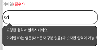
} else if (type === "email") {
const emailRegex = /^[a-zA-Z0-9]+@grepp\.co$/;
if (!emailRegex.test(email)) {
console.log("email", email);
return `이메일 ID는 영문(대소문자 구분 없음)과 숫자만 입력이 가능\n하며, @grepp.co 형식의 이메일만 입력이 가능합니다.`;
}
// 정규식 ^[a-zA-Z0-9]+@grepp\.co$는 이메일 주소가 영문 대소문자와 숫자로만 이루어져 있어야 하며,
// 그 뒤에 @grepp.co가 붙는 형식을 나타냅니다. 따라서 특수문자가 포함되지 않도록 되어있으며,
//특수문자를 입력하면 유효하지 않은 이메일 형식으로 처리될 것입니다.
} else {
const nicknameRegex = /^[a-zA-Z]{3,10}$/;
if (!nicknameRegex.test(nickname)) {
console.log("NIC", nickname);
return "대소문자 구분 없이 3~10 글자의 영문만 입력이 가능합니다.";
}
}
};
3. 에러 메시지가 있을 경우 보여준다.
※ useState
const [test, setTest] = useState([]); // ...
setTest((prev) => [...prev, newValue]);
const changeValue = (
event: React.ChangeEvent<HTMLInputElement>,
type: keyof typeof typeToKorean
) => {
const errorMessage = validateField(type, event.target.value);
// 에러 메시지 업데이트
setErrors((prevErrors) => ({
...prevErrors,
[type]: errorMessage,
}));
console.log(type);
if (type === "name") {
setName(event.target.value);
} else if (type === "email") {
setEmail(event.target.value);
} else if (type === "nickname") {
setNickname(event.target.value);
} else if (type === "role") {
setRole(event.target.value);
} else if (type === "mbti") {
setMbti(event.target.value);
}
checkValidata(type);
};
4. error 창 css 설정
🥕 말풍선 모양
※ transform
transform : 요소에 회전, 크기 조절, 기울이기, 이동 효과를 부여할 수 있다.
아무것도 적용되지 않은 기본값은 none 이다.
scale(sx,sy) : 2D로 크기를 조절하는 transform 함수이다.
transform: scale(0.5);
rotate : 회전을 나타내는 transform 함수이다.
transform: rotate(45deg);translate() : 이동을 담당하는 transform 함수이다.
transform: translate(100px, 30%);skew() : 기울임(왜곡) 변형을 나타내는 transform 함수이다.
transform: skew(20deg, 20deg);
a. 부모 div
position: "relative"
b. 에러창 스타일 설정
.inputError {
background-color: white;
padding: 6px 12px;
border-radius: 4px;
top: -5px;
width: 280px;
/* top: 14%;
left: 50%; */
font-size: 14px;
white-space: nowrap;
font-size: 12px;
position: relative;
border: 1px solid black;
border-radius: 10px;
}
c. 말풍선 처럼 보이게
- position: absolute;
.inputError:after {
border-top: 10px solid transparent;
border-left: 10px solid transparent;
border-right: 10px solid transparent;
border-bottom: 10px solid #484848;
content: "";
position: absolute;
top: -20px;
left: 4%;
}
참고로 ) bottom-top : top : 역삼각형
🐇 Dropdown
드롭다운 형식
1. dropDown 컴포넌트 작성
import React, { useState } from "react";
interface DropDownProps {
label?: string;
list: string[];
selected: string;
dropDownPlaceHolder?: string;
handleSelectedChange: (type: string, selected: string) => void;
description?: string;
disabled?: boolean;
type: string;
}
export default function DropDownCommon({
label,
list,
selected,
dropDownPlaceHolder,
handleSelectedChange,
description,
disabled = false,
type,
}: DropDownProps): JSX.Element {
const [isActive, setIsActive] = useState(false);
const toggleDropdown = (): void => {
if (!disabled) {
setIsActive(!isActive);
}
};
const handleSelect = (type: string, item: string): void => {
handleSelectedChange(type, item);
setIsActive(false);
};
return (
<div className="container">
{label && (
<label className={`dropdown-label ${disabled ? "disabled" : ""}`}>
{label}
</label>
)}
<div className="dropdown-container">
<div
className={`dropdown-body ${isActive ? "active" : ""} ${
disabled ? "disabled" : ""
}`}
onClick={toggleDropdown}
>
<div className={`dropdown-selected ${disabled ? "disabled" : ""}`}>
{selected || dropDownPlaceHolder || "Select an item"}
</div>
<div className={`dropdown-selected ${disabled ? "" : "active"}`}>
{isActive ? "▲" : "▼"}
</div>
</div>
<div className={`dropdown-menu-container ${isActive ? "active" : ""}`}>
{list.map((item) => (
<div
key={item}
className={`dropdown-item-container ${
item === selected ? "selected" : ""
}`}
onClick={(): void => {
handleSelect(type, item);
}}
>
{item}
</div>
))}
</div>
</div>
{description && <div className="description">{description}</div>}
</div>
);
}
2. style 지정
/* 드롭다운 */
.dropdown-label {
margin-bottom: 8px;
font-size: 16px;
font-weight: 700;
color: #333;
}
.dropdown-label.disabled {
color: #777;
}
.dropdown-container {
position: relative;
}
.dropdown-container:hover {
cursor: pointer;
}
.dropdown-body {
display: flex;
justify-content: space-between;
align-items: center;
width: 300px;
height: 50px;
background-color: #fff;
border: 1px solid #ccc;
cursor: pointer;
border-radius: 8px;
}
.dropdown-body.active {
background-color: #fff;
border: 1px solid #666;
}
.dropdown-selected {
font-size: 16px;
padding: 14px 16px;
}
.dropdown-selected.disabled {
color: #777;
}
.dropdown-menu-container {
position: absolute;
top: calc(100% + 8px);
left: 0;
z-index: 1;
width: 300px;
max-height: 200px;
overflow-y: auto;
background-color: #fff;
border: 1px solid #666;
border-radius: 8px;
box-shadow: 0px 4px 4px rgba(0, 0, 0, 0.1);
display: none;
}
.dropdown-menu-container.active {
display: block;
}
.dropdown-item-container {
padding: 16px;
font-size: 16px;
color: #333;
cursor: pointer;
}
.dropdown-item-container:hover {
background-color: #f0f0f0;
}
.dropdown-item-container.selected {
background-color: #f0f0f0;
}
.description {
height: 17px;
font-size: 12px;
color: #333;
margin: 8px 0px;
}
3. 컴포넌트 사용
<DropDownCommon
label={"직군"}
list={roleArr}
selected={role}
dropDownPlaceHolder={roleArr[0]}
handleSelectedChange={(item) => handleSelectedChange("role", item)}
type={"role"}
/>

반응형